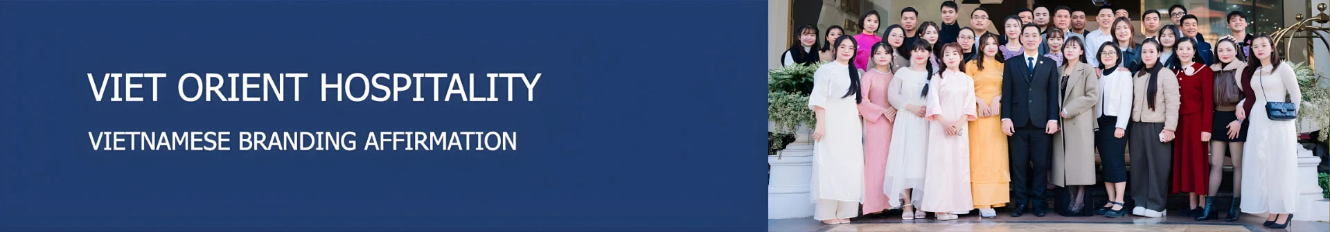
About Us
Posted by: Viet Orient | Date posted: 09/03/2026
1. The historical development of Viet Orient Hospitality
Viet Orient Hotel Management & Consultancy Service Company Limited (Viet Orient Hospitality or VOH) was founded by Mr. Nguyen Van Quang and his specialists whose have been working in international and national hotel management brand-named.
With more than 20 years of professional experiences, Mr. Quang and his team have worked in a various position in hotel industry and obtained intensive practical experiences in hotel set up and hotel management.
In line with the increasing demand of hotel industry, Viet Orient Hospitality was established to meet that needs to become a leading company in hotel consultancy, hotel set-up, hotel training, recruitment and hotel management, to affirm the role of Vietnamese in this hotel industry.
2. Our businesses scope and activities
Company main activities:
► Research and analysis in hotel investment
► Hotel designing consultancy, technical consultancy in hotel building
► Hotel set up
► Hotel training and recruitment
► Hotel management
► Sales & Marketing representative in North and South
Viet Orient Hospitality is providing its services and extending its services into nationwide in the purpose of each tourist destination each hotel under its management.
3. Our specialists
To get along with the development of hotel industry, Viet Orient Hospitality (VOH) is the playing ground for hotel specialists whom have worked and experienced for national and international hotel management brand companies like Vingroup, Sungroup, Accor, Starwood, IHG, Hilton, etc and VOH was established to execute its responsibilities in term of hotel set up, recruitment and training, hotel management under Vietnamese hotel management company.
Therefore, Viet Orient Hospitality concentrates on system strengthening, training at the prior stage, key staff are working national and international brand-name with basic experiences in hotel management and hotel set up.
4. Our brandings
Viet Orient Hospitality (VOH) is aware of each brand standing for its’s services getting along with each level. They are as below:
5 star luxury branding
4 star deluxe branding
 |
3 star upper branding
 |
 |
 |
 |
Boutique branding
 |
 |
Edana Hotels & Resorts
Segment: is a brand for luxury hotels and resorts located in the center of city
Meaning: the meaning of "fire, flame".
Image: The flame is stylized from the letter E - the first letter and "Edana" - the name of the brand, combined to create the Edana Hotels & Resorts logo.
Color: Red is the main color of the logo, representing the color of the fire, passion, movement and strong development and black color is associated with elegance and nobility.
At Edana Hotels & Resorts, we offer guests the service of enthusiasm and passion.
![]()
Lucasta Hotels & Resorts
Segment: is a brand for luxury hotels and resorts located in a tourist resort in classic style with the meaning of "pure light".
Meaning: Lucasta is the name of the girl with the meaning "pure light".
Images: The logo symbol is a stylized image of the poems given by the poet Richard Lovelace to his beloved Lucasta in 1649. Combined with the name of the Lucasta brand to form the Lucasta Hotels & Resorts Logo.
At Lucasta Hotels & Resorts, we build legendary works to give to our lovers.
![]()
Anatole Hotels & Resorts
Segment: Anatole Hotels & Resorts is a brand for luxury 5-star hotels / resorts located in hilly areas.
Meaning: Anatole means "sunrise from the east".
Image: The sun is stylized from the letter O - the letters in the logo and the brand name combine to form the Anatole Hotels & Resorts Logo.
Colors: Green is the main color of the logo representing the colors of plants and hills, creating a green feel like returning to the nature. Meanwhile, the orange color represents the sun creating a vibrant, powerful and passionate.
At Anathole Hotels & Resorts, we bring the green of the mountains and the vibrant colors of sunlight to our guests.
![]()
Maris Hotels & Resorts
Segment: is a 5-star brand of resorts / hotels near the sea.
Meaning: Inspired by Stella Maris - the name of the Virgin Mary in Latin, meaning "Star of the Sea".
Image: The stylized star is made up of images of sailing boats and from Maris - the name of the brand combined to form the Maris Hotels & Resorts Logo.
Color: Blue is the dominant color, representing the color of the sea and ocean. Blue also has the meaning of peace and firmness to bring a sense of security and relaxation.
Coming to Maris Hotels & Resorts is coming to the magic stars of the sea, of peace and stability.
![]()
4 Star deluxe branding
Based on regional criteria and characteristics of each hotel, VOH assigns the brand for 4 star hotels/resorts as follows:
Eudora Hotels & Resorts
Segment: This is one of the 4-star hotel branding towards the classic properties of Viet Orient Hospitality.
Meaning: is the name of one of the 5 Greek gods and also means a generous gift.
Images: A stylized gift box from the letter E - the first letter of the logo and the word "udora" combined to form the Eudora Hotels & Resorts Logo.
Color: Yellow is a symbol of warmth and tolerance, faith and hope. Yellow gives guests a sense of openness and luck.
At Eudora Hotels & Resorts, we bring customers the gift of trust, warmth and luck.
Glenda Hotels & Resorts
Segment: is the name that appeared in the 20th century, grafted from the word "glana" which means purity, cleanliness and "da" which means goodness. VOH shapes Glenda as a 4-star brand in the city center with pure style, personality, dynamism, bringing "goodness" to visitors.
Meaning: means purity, cleanliness and "da" which means goodness.
Image: Stylized lotus and the word Glenda combine to form the Glenda Hotels & Resorts Logo. The lotus is a symbol of innocent beauty, pure soul, perfect essence, just friendlty and elegent.
Color: Pink used in the logo expresses love and romance, expressing purity and innocence combined with bordeaux red to create excitement, energy and enthusiasm.
Glenda Hotels & Resorts give guests a pure sense of soul.
![]()
Calantha Hotels & Resorts
Segment: Derived from the Greek language, this is a brand for a 4-star hotel and resort line in the mountains, in harmony with nature among the plants and flowers blooming.
Meaning: the meaning of the word "Calantha" is the flower blooming.
Image: Velvet rose - a popular, typical flower with a stylized C - the first letter of Calantha combined to form the Calantha Hotels & Resorts logo.
Color: The velvet red used is the signature color of the logo meaning the color of rose, passion and luck.
At Calantha Hotels & Resorts, customer service is our passion, our luck.
![]()
Lani Hotels & Resorts
Segment: which is the name of the Hawaiian people with the meaning of "heaven", "sky". VOH uses this meaning to position 4-star hotels and resorts near the sea. Coming to Lani is coming to the vast sky, where a paradise of relaxation with immense space of sea is welcoming.
Meaning: with the meaning of "heaven", "sky".
Images: Blue coast, stylized sun and Lani words combine to form the Lani Hotels & Resorts Logo.
Color: Blue is the dominant color representing the sky - heaven - ocean. Blue also has a meaning of peace and solidity and trust. The immense blue of the sky as well as the tranquility of the ocean as immutable things that can relax the soul and create a fresh, clear feeling.
Logo of the liberal nature of the sea. Lani Hotels & Resorts is coming to the vast sky, where a paradise of relaxation with immense space of sea awaits.
![]()
3 Star upper branding
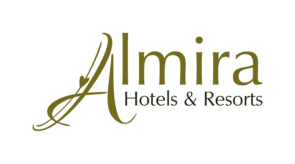
Almira, Cosima, Seline and Arian are standing for 3-star hotel segments located in the center of city or tourtist area with standard services, reasonable price, suitable to the mid-range need of tourists.
Almira Hotels & Resorts
Segment: is the name derived from the Arabic language meaning "princess" or "noble girl". Here, VOH shapes its hotel into a beautiful and luxurious place of stay, aristocratic as a beautiful lady with classic style.
Meaning: meaning "princess" or "noble girl".
Image: Letter A - a flexible, stylized first letter like a noble princess combined with the word "lmira" to form Almira Hotels & Resorts Logo.
Color: The yellow of the land symbolizes the trust associated with the dark green color to bring elegance, classic and elegance.
Almira Hotels & Resorts - The charming princess with a classic style.
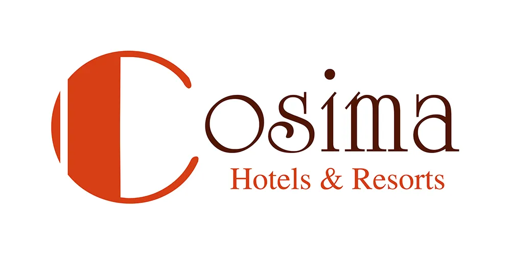
Cosima Hotels & Resorts
Segment: is a 3-star hotel / resort brand with a modern style
Meaning: with the meaning of "harmony and beauty".
Image: Letter C - the first letter of the stylized logo and the word "osima" combine to form the Cosima Hotels & Resorts logo.
Color: Sepia symbolizes sustainability, stability, and simplicity. This is the color to create a sense of health, orderly and conventional.
At Cosima Hotels & Resorts, harmony, beauty, tidiness are our principles when serving guests.
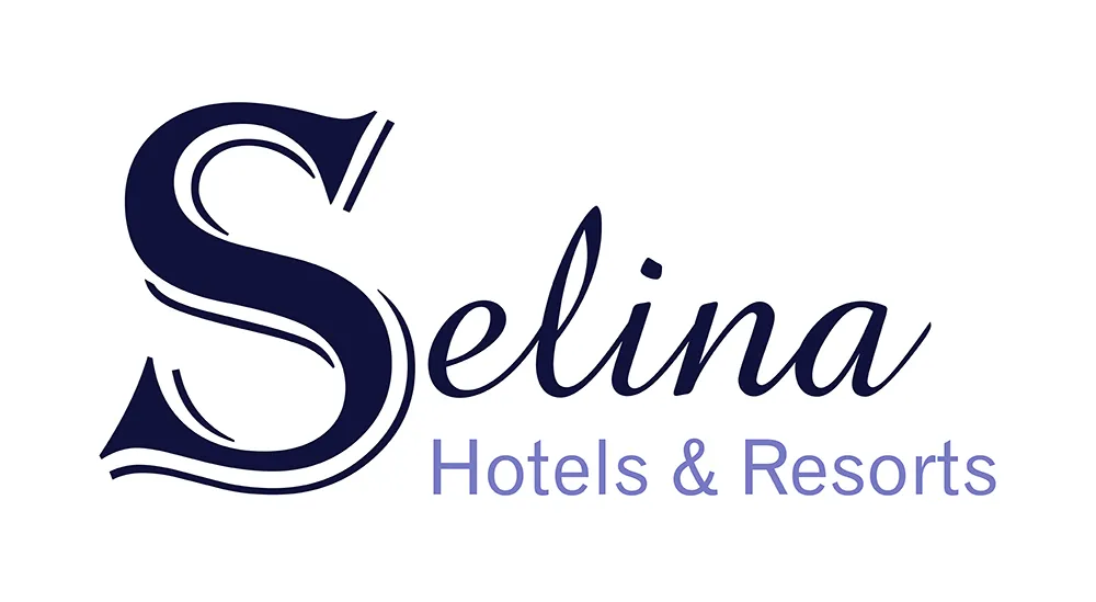
Selina Hotels & Resorts
Segment: This is a brand for 3-star hotels / resorts in hilly areas, where visitors can see the "moon" every day.
Meaning: Selina means " the Moon".
Image: Seline is derived from the Greek word Selene which means "moon". The letter S - the first letter of the brand combined to create the Selina Hotels & Resorts logo.
Color: The dark blue color is used as a logo color meaning Moonlight illuminates the deep blue sky of the night.
Selina Hotels & Resorts is a place where guests can immerse themselves in nature, admire the moonlight shining every night.
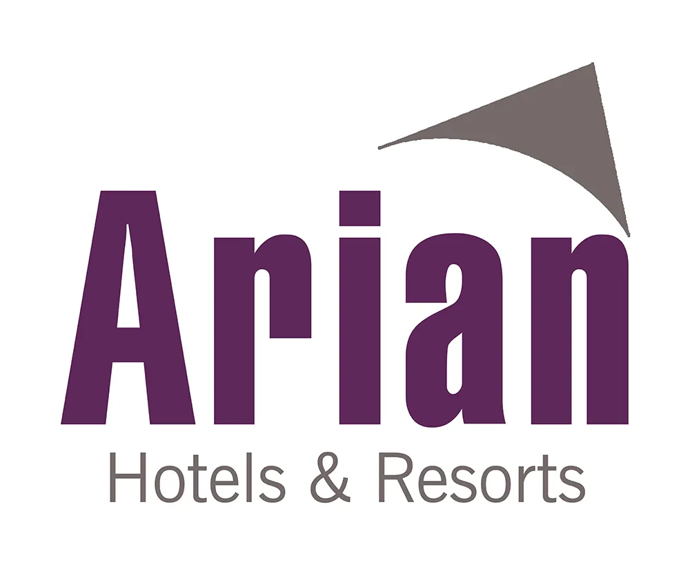
Arian Hotels & Resorts:
Segment: Arian is VOH brand for 3-star hotels / resorts in the sea.
Meaning: With the meaning of "brilliant, beautiful, shiny like silver".
Image: A stylized hat - a symbol of Vietnam tourism - impressive for international visitors used in conjunction with the word Arian to create the Arian Hotels & Resorts logo.
Color: Purple is a symbol of romance combined with silver as the luster of the sea.
Arian will bring visitors a wonderful experience with the beautiful, silver-like water andand very Vietnamese.
Boutique cozy branding
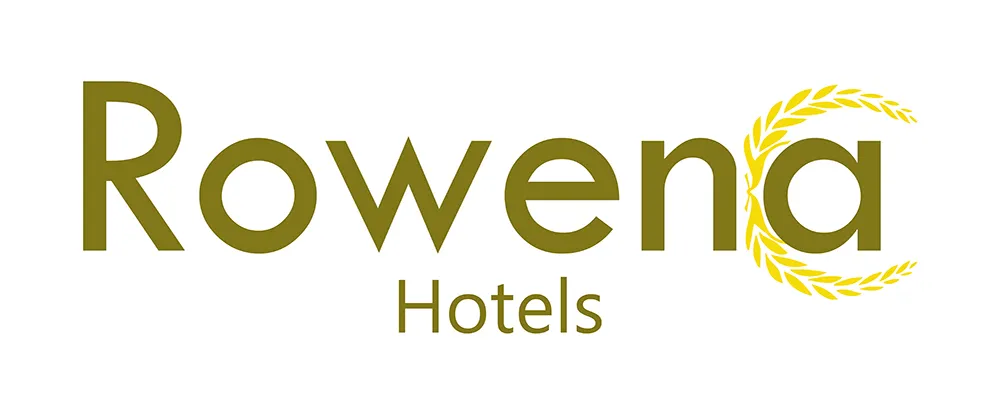
Rowena Hotels
Segment: Rowena Hotels is a class of boutique hotels with a classical style
Meaning: with the meaning of "fun".
Image: Laurel wreaths mean joy, winning is integrated into the logo, forming Rowena Hotels brand.
Color: Yellow is considered a color with a classic, traditional but no less luxurious feel. Yellow shows joy, optimism and victory.
Rowena Hotels: Bring joy to customers.
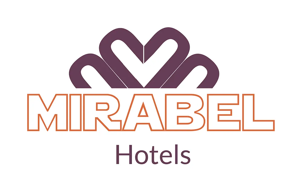
Mirabel Hotels
Segment: Mirabel Hotels is the segment for boutique hotels
Meaning: which means "magic, beauty".
Image: The crown is arranged from two stylized M letters, forming the heart in the middle and from Mirabel - the name of the brand combined to form the Mirabel Hotels logo.
Color: Light purple is said to have feminine energy, romance and sophistication combined with orange to show dynamism and extrovert.
Logo is about modernity, personality. Coming to Mirabel Hotels is coming to the magic, beauty of dedicated service.
Combining the cultural values of the world into the meaning and design of each hotel segment and branding is the leading guideline in hotel set up and management of Viet Orient Hospitality. Culture - People are the two important factors in the company's branding structuring: always honoring unique cultural values and people are the inspiration to create as well as to enjoy the cultural values.
- VOH Announces The Joseph Anatole Bac Ha Resort Project
- Viet Orient Hospitality (Voh) Announces The Appointment Of Hotel Director (Gm)
- Glenda Tower Moc Chau Hotel Managed By Viet Orient Hospitality Welcomed The President Of The World Travel Awards
- VOH affirms the brand value of Vietnamese tourism
- 4-star stay at Glenda Tower Moc Chau Hotel managed by VOH
- Viet Orient Hospitality changes company name and address
- Revenue commitment in Hotel management
- 4 Vietnamese cities are in the top most visited cities in 2019
- Signing ceremony of setting up and training Halong New Day Hotel